2014
Gold standard of graphic design.
DELIVERABLES
- Logo design
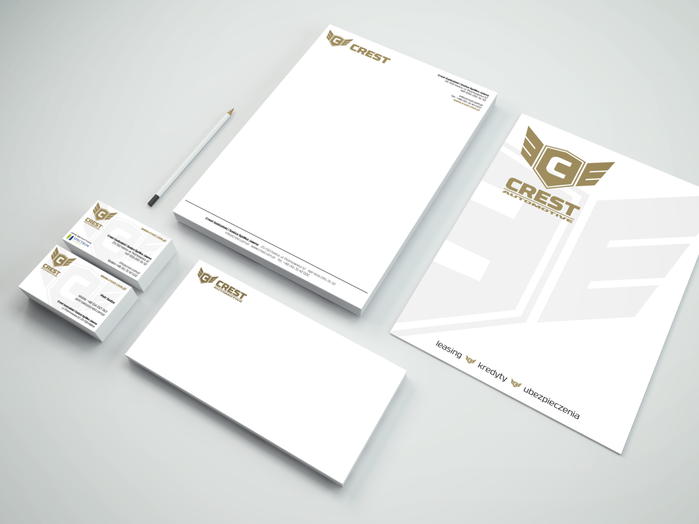
- Corporate Identity
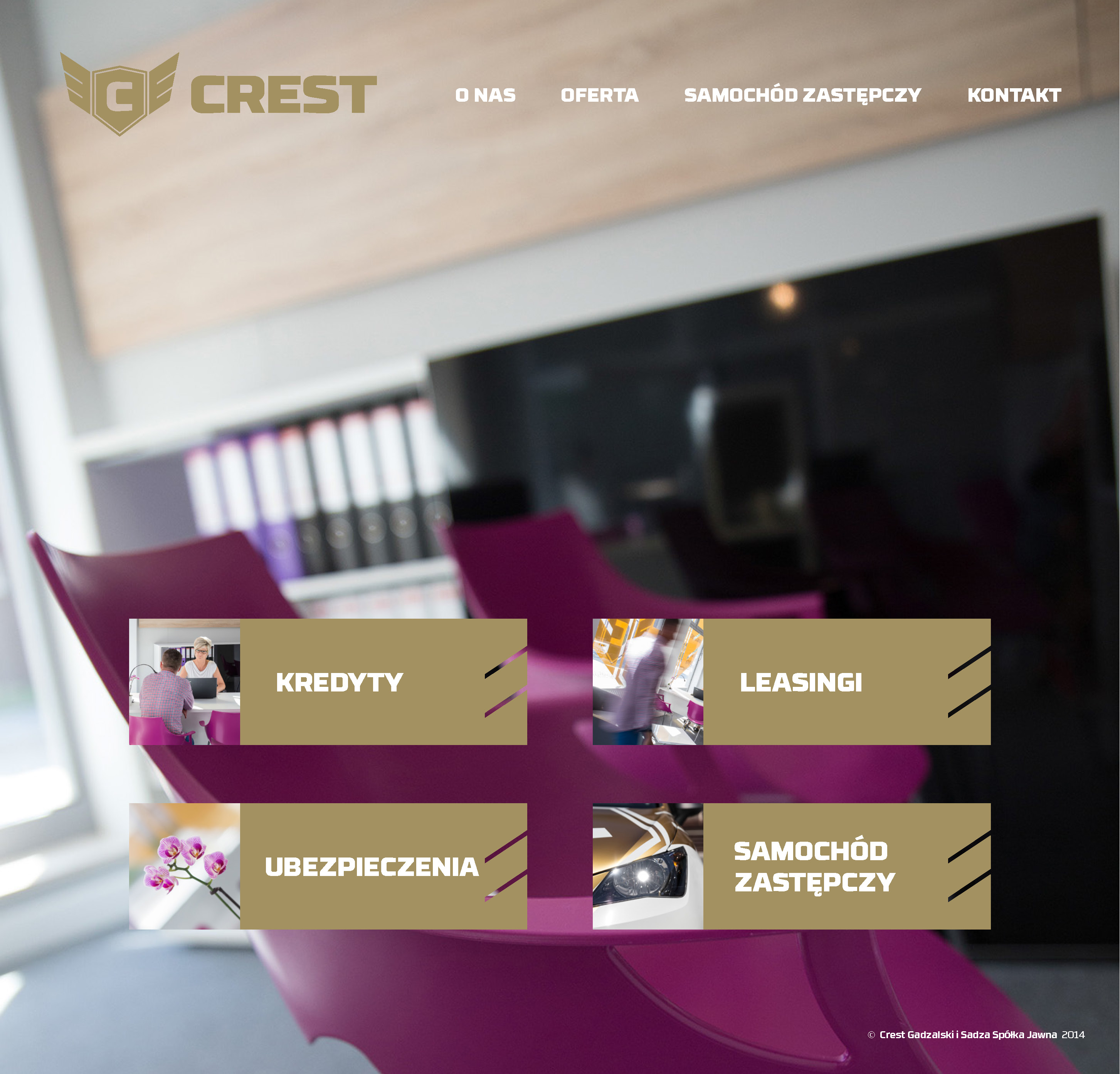
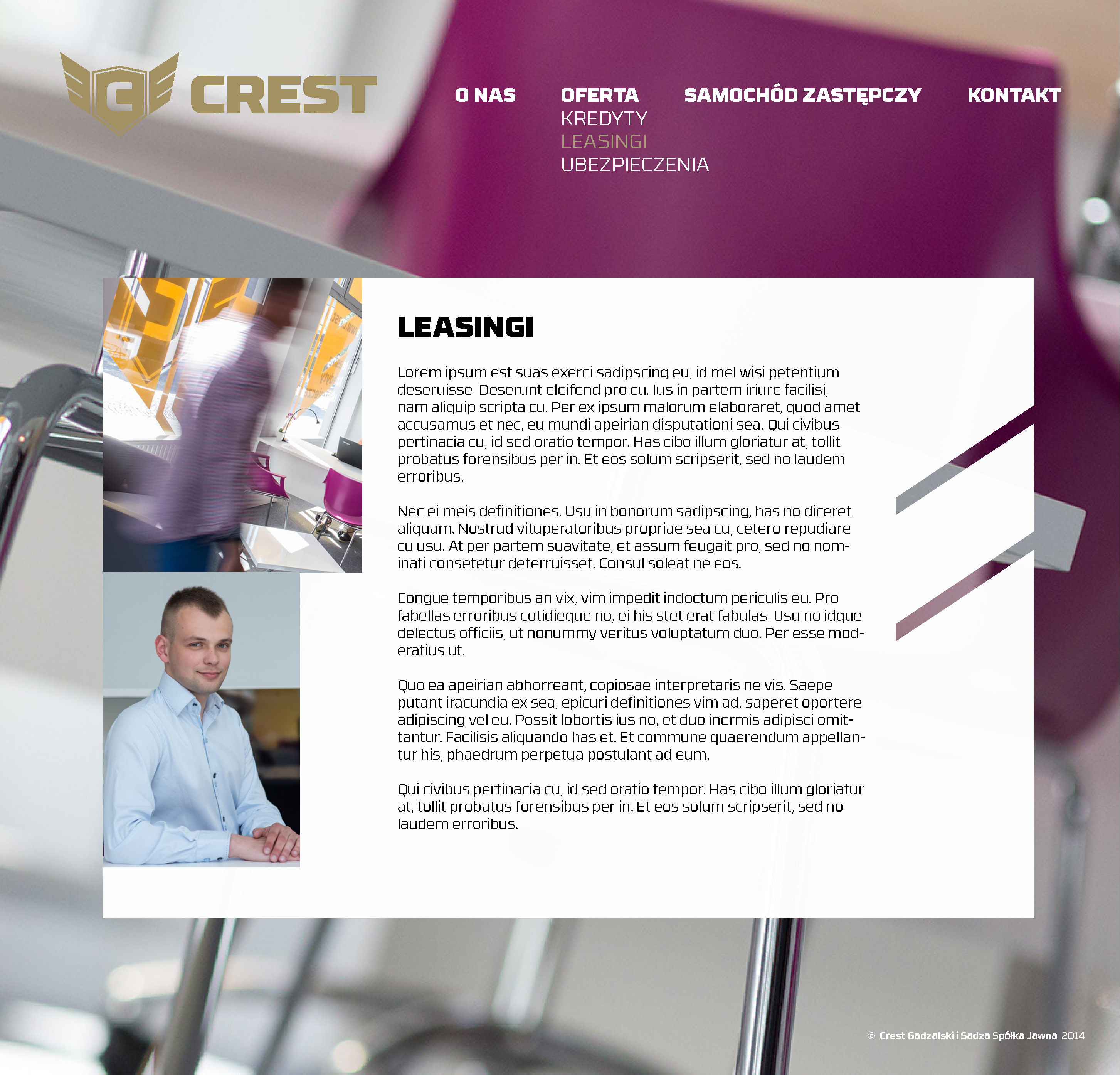
- Corporate Website look and feel
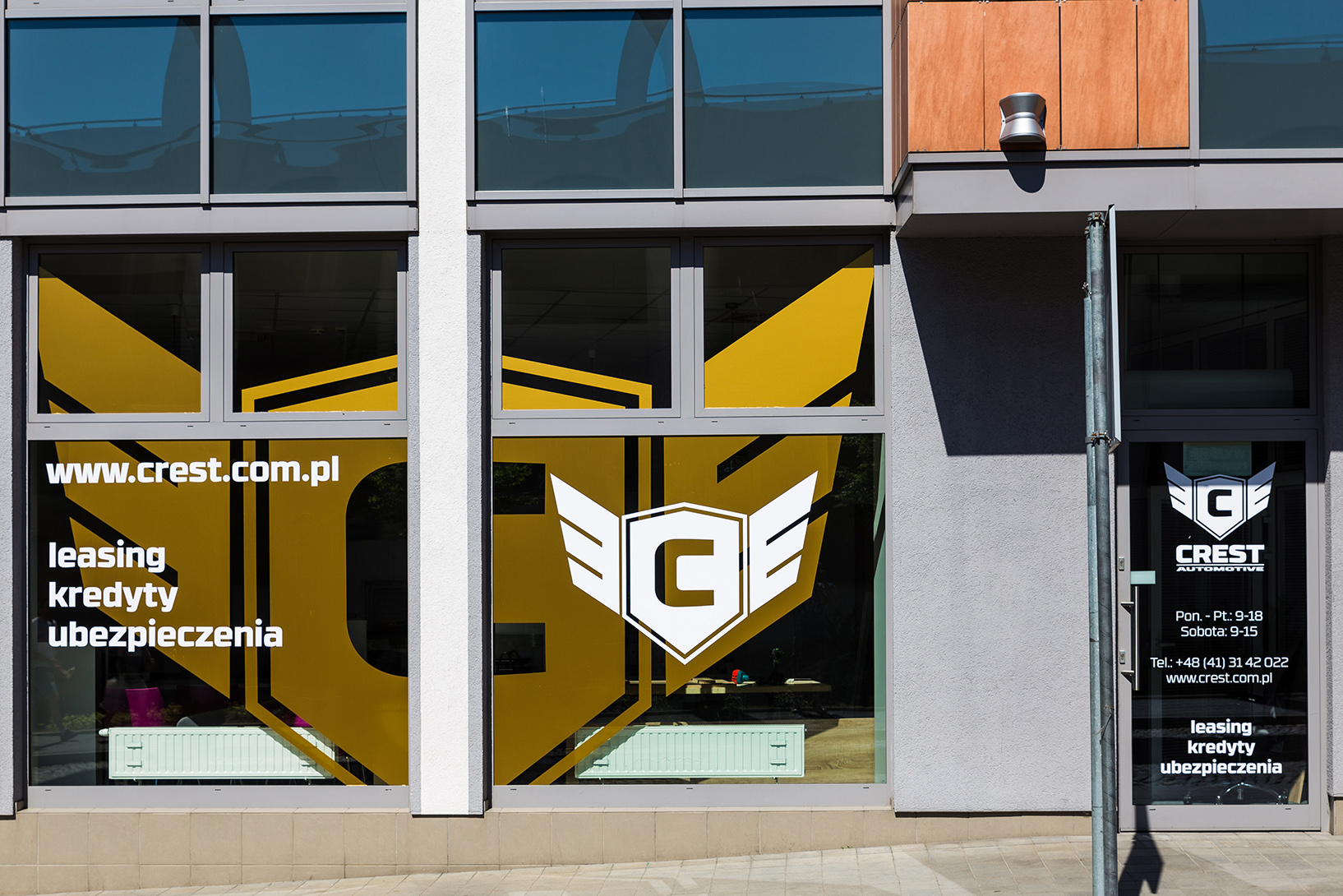
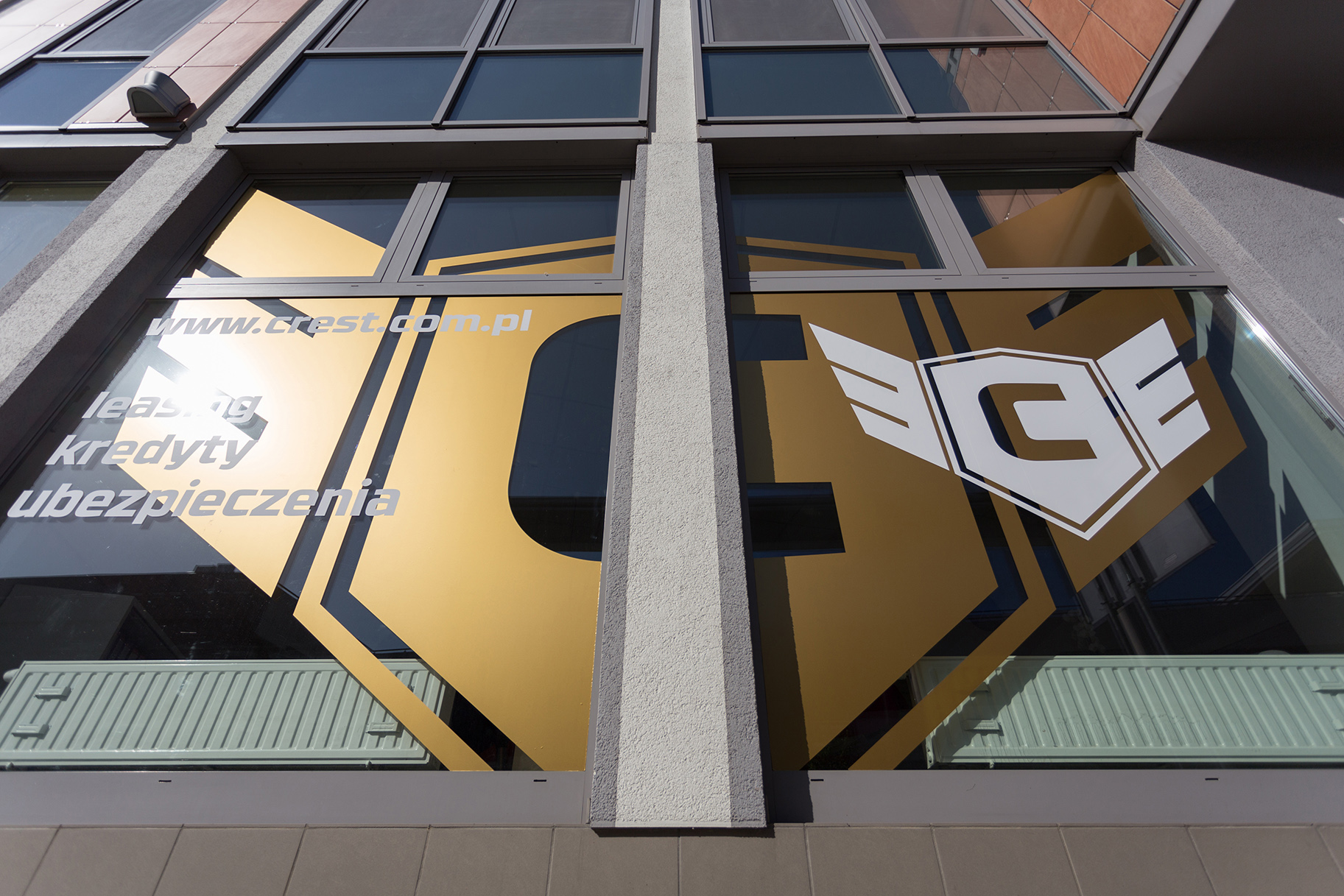
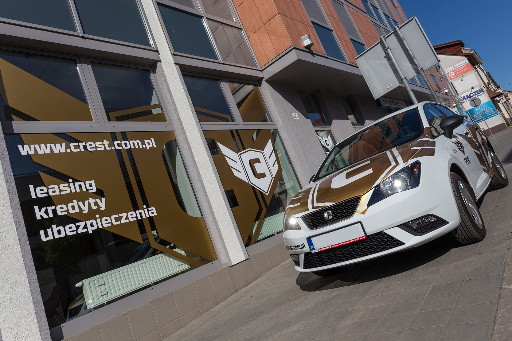
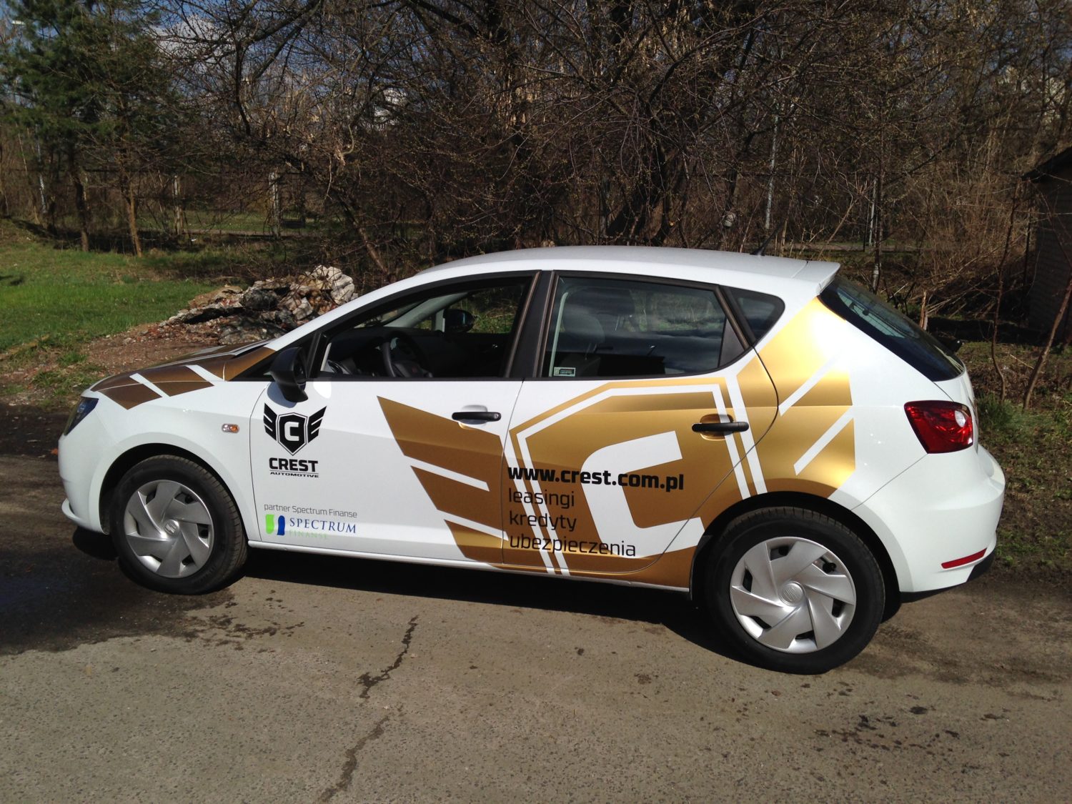
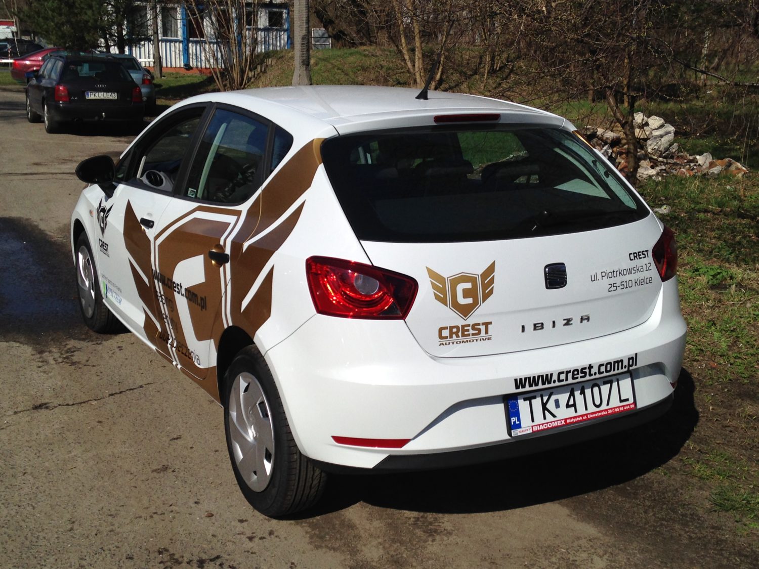
- Window graphics and car wraps
CLIENT
YEAR
Crest is a company started up by a friend of AtmoStudio, who when he heard all about our work immediately got on the phone to us and demanded we design his new company’s logo. OK, no problem! The name Crest conjured up images of heraldry and so we thought we would try to use that motif but in an up-to-date and funky way. And so we created the ‘flying shield’ logo!
To maintain the noble look of this fine logo, we decided that the colour just had to be metallic gold. Well, our head of design decided and wouldn’t take no for an answer, actually. We first applied the logo to striking metallic gold graphics for their company cars and followed these with equally striking window graphics for their office in the centre of Kielce. Next up was corporate stationery – yep, all the graphics were metallic gold – and finally we set up the look and feel of the Crest website.


