Archibis
Year
2015
Deliverables
- Logo redesign
- Branding
- Corporate stationery
Facelifting an existing logo for a more modern look.
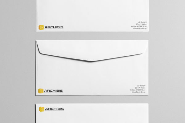
Archibis is a firm of architects that had been in business for a few years, but wanted to re-energise their look. They asked us to ‘facelift’ their logo, as it was somewhat dated looking. We were asked to keep the stylized AB element and colours from the previous logo and we added the 3D cube to give the impression of form related to construction – a building block.
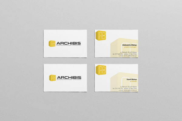
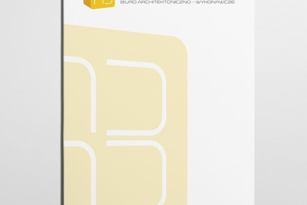
We then applied this new look logo to a full range of corporate stationery items.


