Martins Real Estate
Year
2018
Deliverables
- Logo Design
- Branding
- Corporate stationery
- Signage
- Website elements
A different approach for a real estate agency.
When we were first approached by Martins Real Estate to design their logo, the client told us that her favourite colours were marine-style – we’re talking nautical, as opposed to military – so naturally we decided that this project would be based around Navy blue and bright red. We proposed 4 different logo designs and the client immediately chose the featured design that you see on this page. Job done!
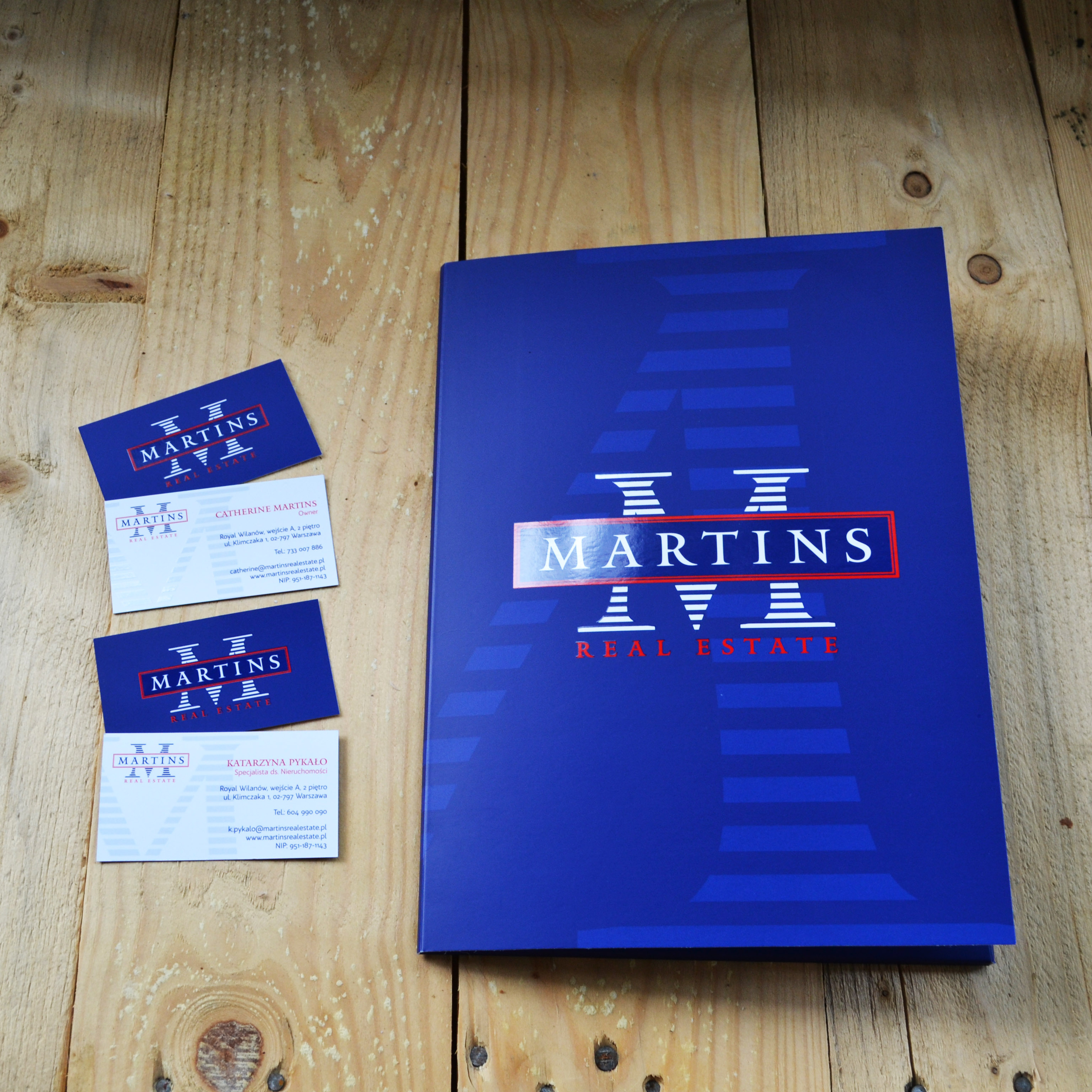
The next phase of this project consisted of preparing business cards, signage for the office, and A4 folders for use by their clients to store documentation.

Colours
For a marine feel, we used a combination of Navy blue and bright red, as seen below.
Blue
Pantone 2747c
Red
Pantone 2347c
Typography
Mantinia

BW Quinta Pro


